Pretty as Pie
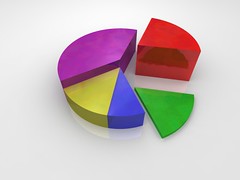
I've just spend a couple of hours dusting off an old project of mine, that involved generating pretty 3D pie charts by combining Mako templates with the Povray scene description language. I improved the image quality by enabling radiosity, and the end result is quite appealing (see below).
Now I'm thinking that there may be some people out there who would be prepared to pay to generate such images for websites or for print, and it wouldn't be too hard to extend the idea to other forms of chart, such as bar graphs. So, dear lazyweb, is there a big enough market in such a thing to warrant sinking my valuable spare time into?
no there isn't. Just release it as open source, will ya!
This image makes me very sad. Pie charts that are distorted along one axis (commonly for whizbang foreshortened 3d effects) do not have any correlation between the area of the slice and the value being displayed. I was very disappointed when the google graphing URLs included 3D pie charts, as they're useless at conveying information in a way that can be understood by the reader.
John, maybe one day!
Nick, granted a 3D pie chart makes it a little harder to determin relative proportions than a 2D one, but I don't think they are useless -- people are used to viewing real world objects with foreshortening. I'm also looking in to ways of displaying the actual percentages over the pie chart...
Same as Nick,
these diagrams are really beautiful, but totally loose their meaning in 3d.
I'll add to the chorus, but go further: pie charts (2D included) rarely express anything about data that can't be expressed in far better ways through bars or stacked bars. They're just visually appealing, which is why you really need to target business/marketing powerpoint types, looking to dress up their online presentations. They love this stuff.
I agree with the other folks. The pic you generated is gorgeous and belongs on the cover of a textbook for statistics or marketing or something. But it's not useful to convey information, which is the purpose of a graph.
Even without the 3D foreshortening, pie charts are considered "low density and fail to order values along a visual dimension." Distorting them with 3D, shadows, reflections, height differences, etc. just obscure the information worse.
You might want to read Edward Tufte's books, or the "Ask E.T" forum:
http://www.edwardtufte.com/bboard/q-and-a?topic_id=1
Great chart.
Please ignore the overly pretentious ones who claim that it distorts anything.
A piechart's role is to convey an approximate area, it does not matter if it is slightly distorted. One only cares about whether the areas are about equal, twice as big etc.
The image is gorgeous. There is a market for gorgeous stuff. Otherwise we all be using gnuplot ... yikes.
But as far as charting libraries go, you'll need to have a large number of them, plus customization. It is a tough project.
[...] http://www.willmcgugan.com/2008/06/29/pretty-as-pie/ asks Hoosgot, [...]
[...] think it was this project that started my pie chart fetish. I wonder if there is a support group or something… Share [...]
A beautiful image, but very confusing. A pie chart is used for a visual presentation of data. The size of a part corresponds to the relative size of this part of the data. In your example, multiple interpretations are possible:
angle, height and even volume.
A chart like this could really make sense if you want to visualise multiple factors. Example: sales figures for visitors to a webshop, sorted by country of origin. In that case the circle parts could represent the country of origin, the height of the parts the average amount paid and the volume of each part would represent the total amount of sales to that particular country.